Game design lessons from working at Disney
During a recent conversation about game programming techniques with a friend, I was asked why I chose to work for a themed-entertainment company like Disney when I am so passionate about games. I believe it is a relevant question since breaking into the games industry is hard.

To address the question, for a moment, consider a Disney Park to be an open-world game played in real life. The guest has multiple experiences to choose from and the option to experience them in any order. In addition, Disney has to ensure a positive experiences for thousands of guests at any point in time, and still leave them with a desire to come back for more. Then repeat this everyday. Sounds like some of the challenges while designing a game? It does to me.
So here are a few game-design lessons I’ve learnt from my time at Disney.
Weenies - Indirect control in an open environment
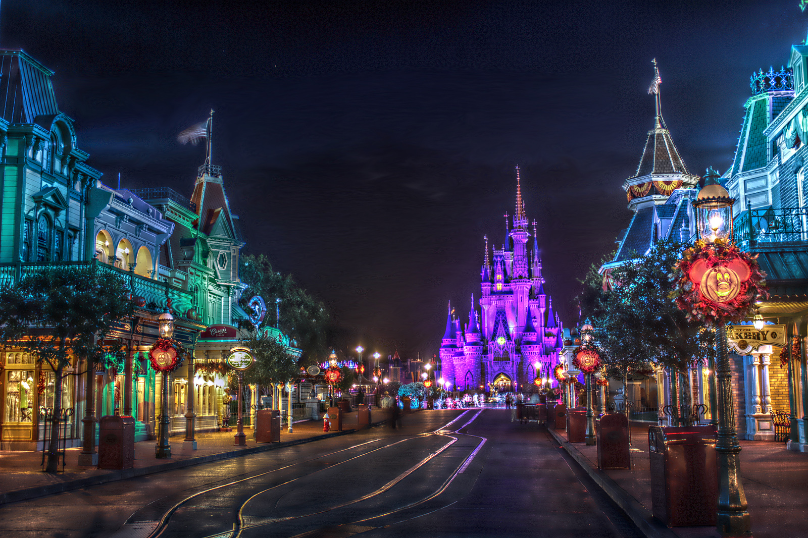
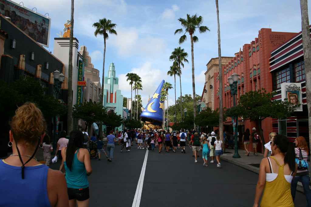
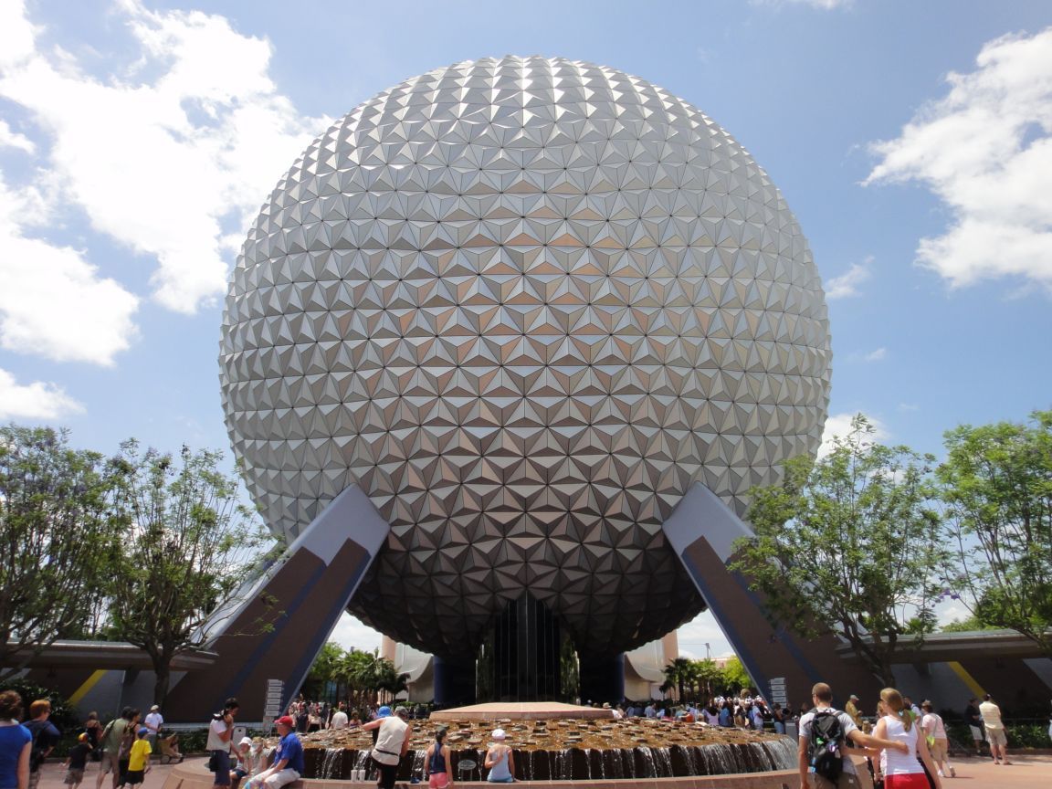
No dear reader, it’s not what you think. Everything Disney has to be clean, wholesome and family oriented. So in Disney parlance, a weenie is a visual icon to draw the guests into the park. If you’ve ever been to a Disney park, you’ve seen a weenie. Cinderella’s Castle at Magic Kingdom, The Epcot ball, The Tree of Life at The Animal Kingdom or The Sorcerer’s Hat at Hollywood Studios are all weenies.

But why use weenies?
Because they are awesome. That’s not a good enough reason? Alright alright. When you have a guest/player entering a large empty space, you do not want them to be overwhelmed. A more favorable reaction as a designer is to elicit a reaction of awe and freedom and make them want to explore this large space. Can you see how the weenies tower up on the horizon? They give the guest/player a purpose and direction to move in.
By the time the guest actually do reach the weenie, it is far less imposing, allowing them to think about which way to go explore the rest of the park.
Looking at the map of Magic Kingdom might further illustrate this. The castle is right at the center of the hub and spoke layout. At any point in time guests can have a bearing on where they are in the park simply by glancing at the castle.
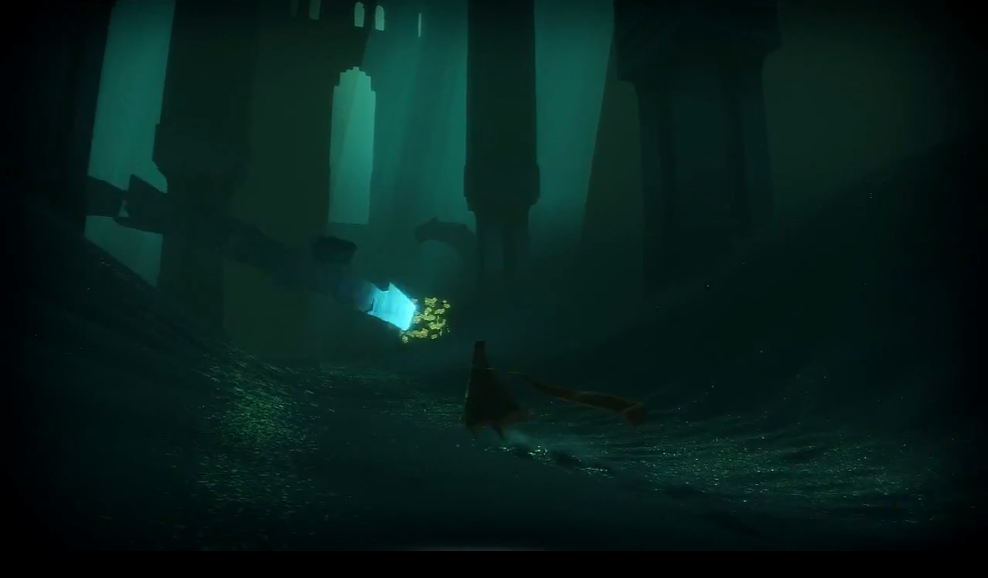
Weenies in games
The most prominent use of a weenie I can think of is at the start of Journey. If you haven’t played it yet, you really should. Without intending to spoil ‘the reveal’ by showing a screenshot directly, here is a similar image that illustrates the concept:
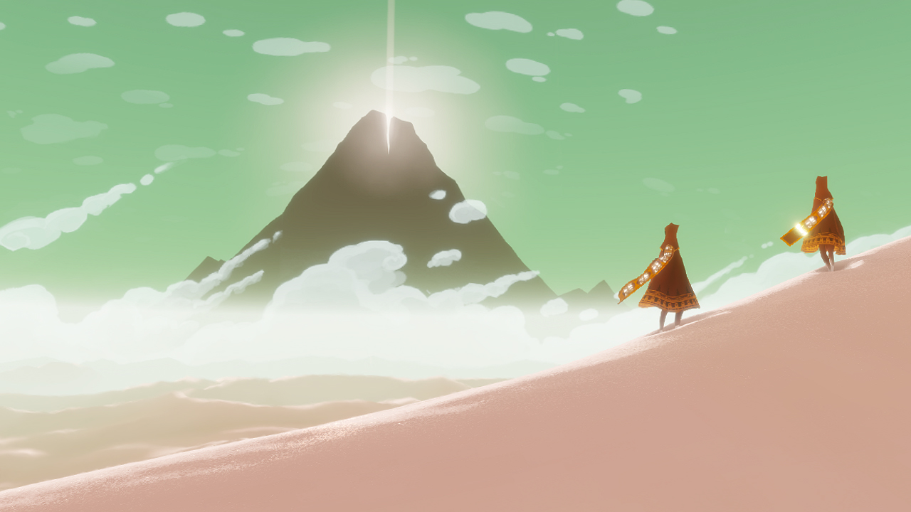
Throughout the rest of the game you pretty much always have a view of the mountain, always keeping the goal in sight.
There are also examples where real life landmarks are used in video games, much to the same effect, as seen here in Assassin’s Creed 2 and Fallout 3.
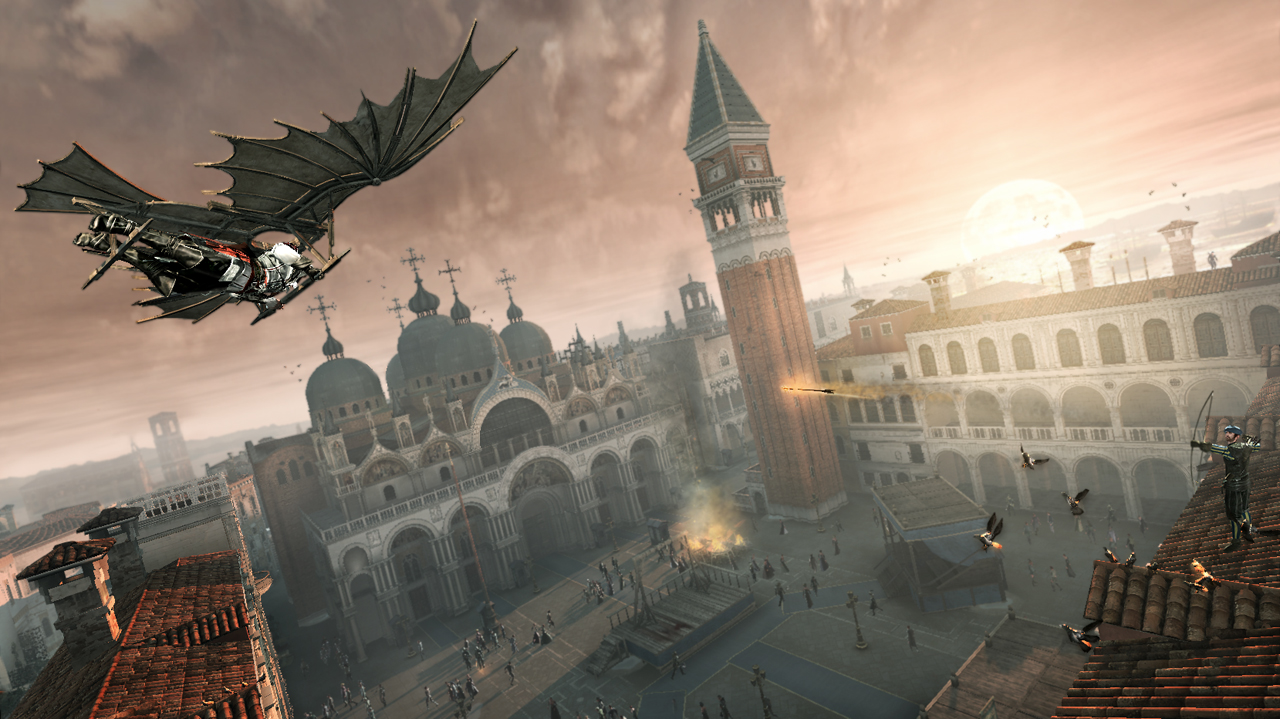

Can you spot the weenies?
Teaching by showing - Maintaing immersion
Some of the most compelling stories are the ones that make the viewer feel that they are immersed into the story. You often hear people describe their favorite movie by saying “It makes you forget everything else and be a part of it.” Seamless immersion is one of the most important factors of enjoyable gameplay.
Disney does something similar with some of their attractions. For eg. Rock-n-rollercoaster is considered one of the most thrilling rides at Walt Disney World. The ride goes from 0 to 57 miles per hour in 2.8 seconds.
Sounds cool? Maybe. You know what’s cooler? Seeing it.
In order to make it exciting for the guests, the queue is designed in such a way that right before boarding the ride, the guests are made to stand a few feet away from the launch of the roller coaster, so that they can actually see the coaster shoot off into the tunnel. That raises the anticipatory excitement of the guests to a crescendo.
Can you feel it? Doesn’t it work so much better than putting up a sign that reads “0 to 57 in 2.8 seconds”?
Examples from games
The strongest example of where this is NOT done is from the game I am currently playing: Dishonored. This is a snap of the instructions that suddenly pop up on screen the first time you approach a guard:
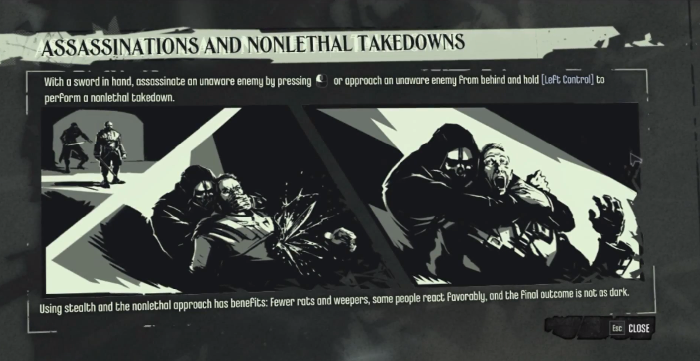
Beautifully done, and I really love the game, but for that moment I do remember finding it a little jarring. Contrast that to the door-opening or inventory from Dead Space 2, both of which are overlays on actual objects in-game:
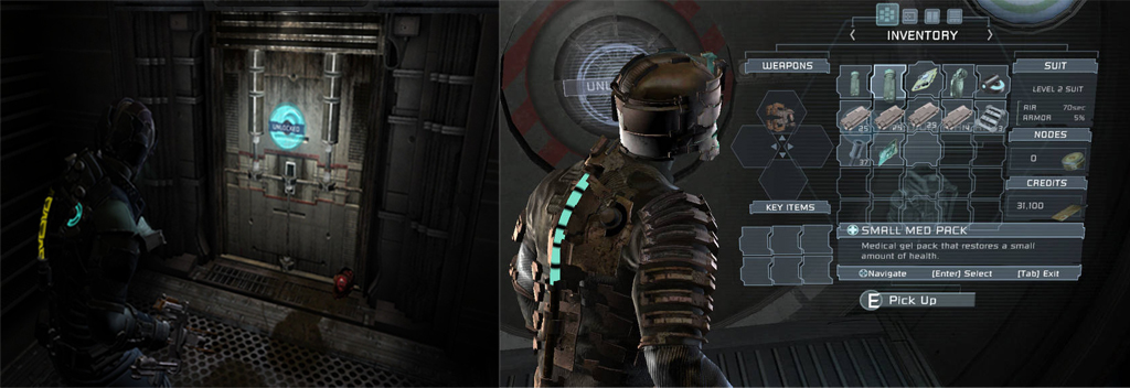
Moar Immersion. Do you feel that works better?
A similar concept is that of teaching the player what to do intuitively rather than flashing written instructions. For example the first time you meet a hostile character, you do not need to be told to avoid it. The first time you really see it, it is attacking a bunch of innocent-looking flying things and that immediately screams ‘Stay the hell away.’
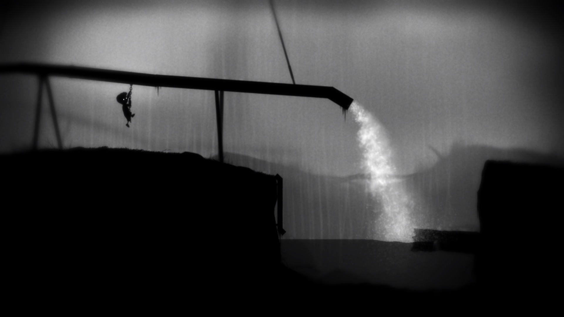
Another game that does this brilliantly is Limbo. Some people might say it has a steep learning curve but I believe that is partly where the charm of the game comes from. It forces the player to think and connect the dots, much like life.
So I guess what I am saying is that there are many design principles that can transfer over from themed-entertainment to games, if observed and applied. I mean, if they call Disney ‘The happiest place on Earth’ there is definitely something to be learnt from how they do it. Everyday.